This one is obviously an independent children’s fantasy book (read: cliché-ridden story by an unknown author), which’ cover image is obviously made by his friend (read: someone who knows basically how to draw, but not what he’s drawing about, also full of clichés and horrible graphic design).
Despite the blatant rape of the already ugly title font, this cover showcases overall poor typographic as well as illustrational sense.
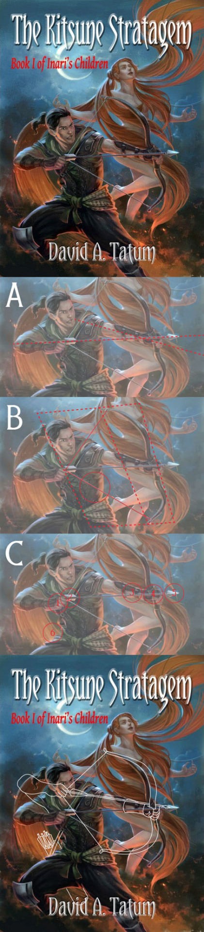
But now to the (arrow)point of it.
Mistakes:
1. In the picture A you can see that the archers line of sight/bow hand is very different than the line of his arrow hand, so he has no idea where he’s missile will be flying. He would not hit a target if it was three meters away! This is a bad error.
2. In the picture B can be seen the most often made mistake in archery drawings, that the bow doesn’t bend when drawn, but the string stretches. This is not how the bow works! Any of the bows. The string is not some rubber band, it doesn’t stretch. It is indeed the bow itself that bends, thus creating much more force than any rubber band ever could. If it’s just the rubber band which streches, then the thing is not called a bow, but a slingshot! In this picture I have drawn a rectangle (adjusted to 3D space) from the foremost part of the bow to the end of the fully drawn string, plus a vertical line, which shows where bows nocks (ends of the bow arc) place in that imaginary box. The bow should bend that the nock-line would be in the middle of the box, and now it only is at one third of that rectangle.
3. You can also see another mistake, which I’ve highlighted in the B picture. The 3D adjusted bow box is clearly very much tilted. The bow is thus held diagonally, when it should be vertically held. This is minor ‘sideways shooting’, which is always a mistake. The red circle in this picture shows the area where the string touches the archers flank, so it cannot be drawn any further from there. And it could if the bow would be held properly, and drawn to bend realistically.
4. The picture C shows various other errors in this book cover. Like that the bowman is not holding his arrow and string properly, actually he’s not holding the string at all, only the arrow, which would be very insecure and childish method (highlighted in the circle number 1).
5. The arrow’s fletching is too back, so there’s not much room for fingers to hold it. In this picture the bow string also touches the fletching, which is not good (circle 2).
6. The maker of the cover picture has drawn this guy some ‘bracers’ (incorrect term for a piece of plate armour, correct term being vambraces, but I’m not going to use it here, since these are not anywhere near real vambraces), made out of leather, so the only purpose for them could be to protect the left forearm of the archer while he’s shooting, since leather offers almost none protection from weapons. However the ‘bracer’ of the left arm is drawn on the outside of the arm, so it doesn’t protect the arm from the possible (and frequent) hits of the bow string. It’s obvious that the draughtsman hasn’t known the purpose of these ‘bracers’, he’s just drawn them like this, since it’s a fantasy cliché that every character always has to have them (circle 3).
7. The arrow goes wrong side around the bow. In this position it would fall off (circle 4).
8. Arrow tip weights a kilogram since it’s so big and the arrow would fly a few meters at best being so over tip weighted (circle 5).
9. Where are his arrows? He only has one? That’s one stupid bowman. I’ve drawn the circle 6 where there should be a quiver.
And in the final picture I’ve corrected all (well, not nearly all [the bowman’s stupid knee patches, his fantasy leather vest, the unmistakable sexism in the portrayal of a woman, the fact that this picture has humans in it, but cannot be from Earth, since the Moon is too close…], but all archery related) errors and mistakes. The white line shows the proper bending of this recurve bow and the correct posture for shooting. I also added the hip quiver and one ‘bracer’ the right side on.
Good:
Not much, but there are much much worse to come!
No comments :
Post a Comment